Pressure!
You don't get diamonds without it.

Ok, pencils down on pages 4 and 5. I could always fuss with them more but things are getting real as I commit to upcoming shows this year. Count me in for Thought Bubble this November, hold me at a maybe for SPX in September, and fingers crossed for Lightbox in October. This comic is about 30 pages and, call me old fashioned, but I’d like to debut and sell it in person at one of these shows. It’s extremely helpful, and scary, to start seeing dates on the calendar, but diamonds don’t happen without pressure.
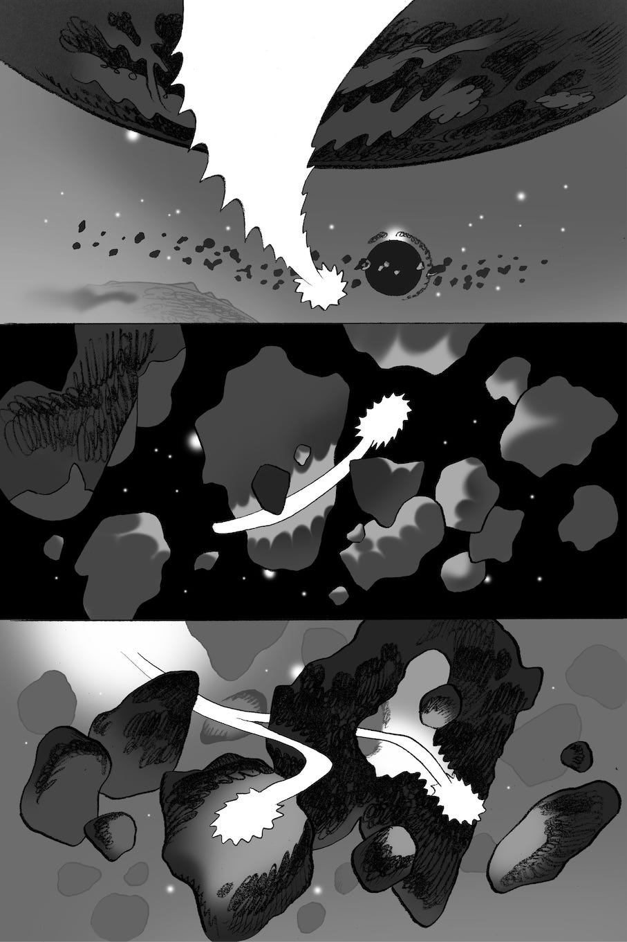
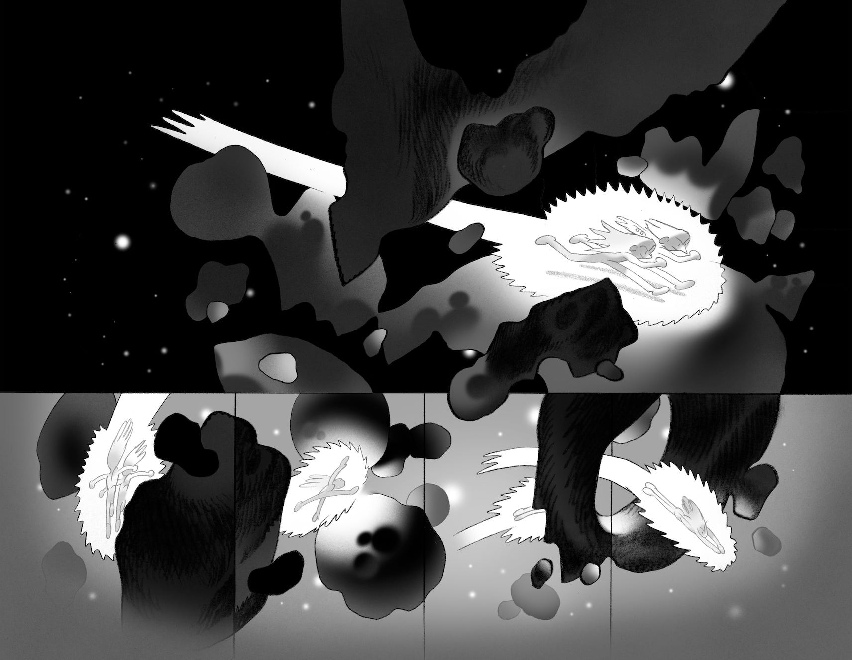
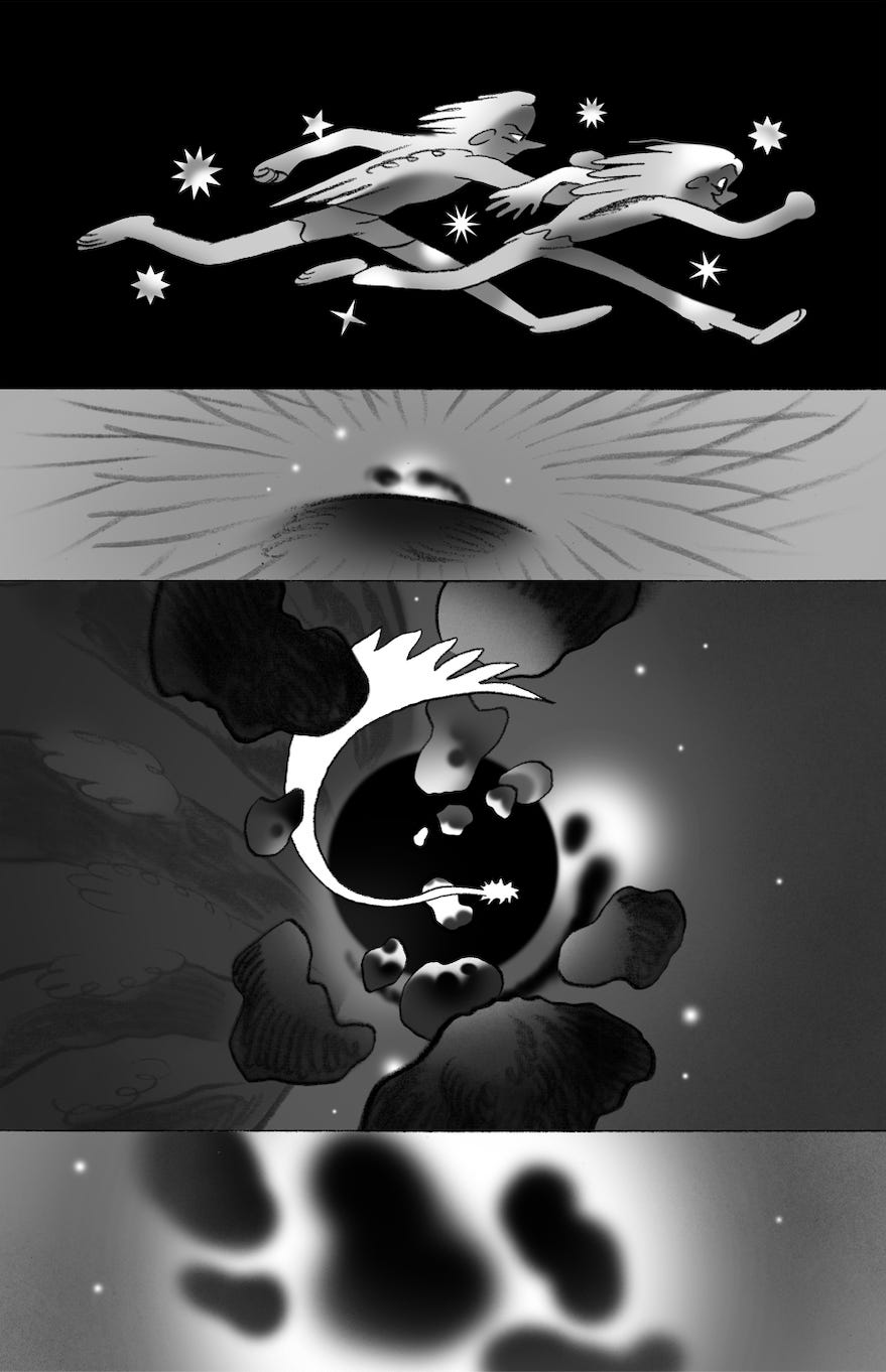
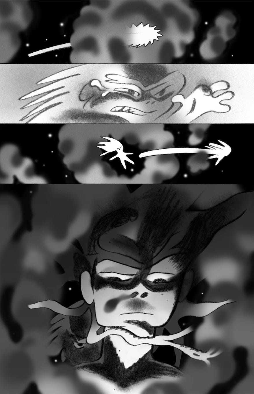
Widescreen panels are doing it for me and I can’t exactly say why. I did just pick up a copy of Tom Scioli’s Space Opera Xanadax and was presently surprised to find it all done in wides and gigantic splash pages. It was extremely flippable, making the visual reading experience very fun. You’ll have to visualize what I’m about to say because it’s late and I’m not going to draw a graph: the readers eye typically goes in a Z pattern across a comic page because the typical comic has a sequence of panels that you read from left to right and then down, but if it’s a stack of wides you can just read it dow—okay, you know what, it is actually easier to just draw this thing:
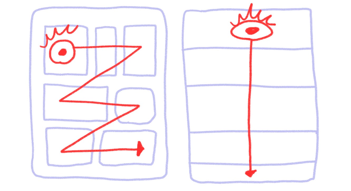
Unsurprisingly this is exactly how most of us engage with images these days, scrolling down on a feed. It would be easy to rail against the machine for this but honestly I can experience a significant amount of fritzing(frantically searching for a place for my eye to rest) when I first open a comic that just has too much information packed into it. Offenders can be too many panels, too many lines, too many colors, too many words, and limitations on at least a few of those can do wonders for readability.
In other news, this is Holy Week and Easter is on the horizon. My mom sung hymns to my brother and I throughout our lives. Her Dad sang them to her, and I assume either his father or mother sang them to him. I now sing them to my children with the recent addition of illustrating some of our favorites:
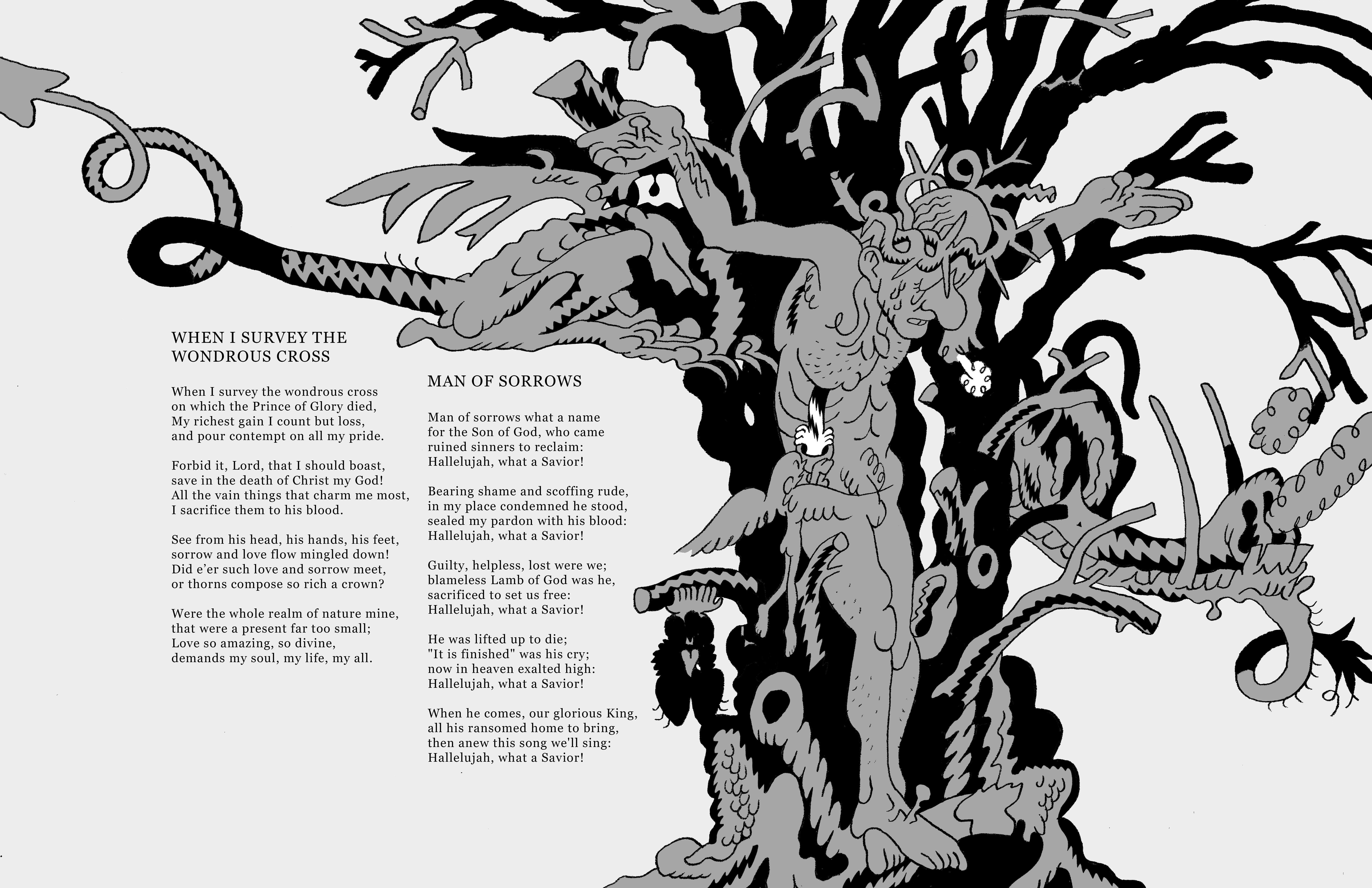
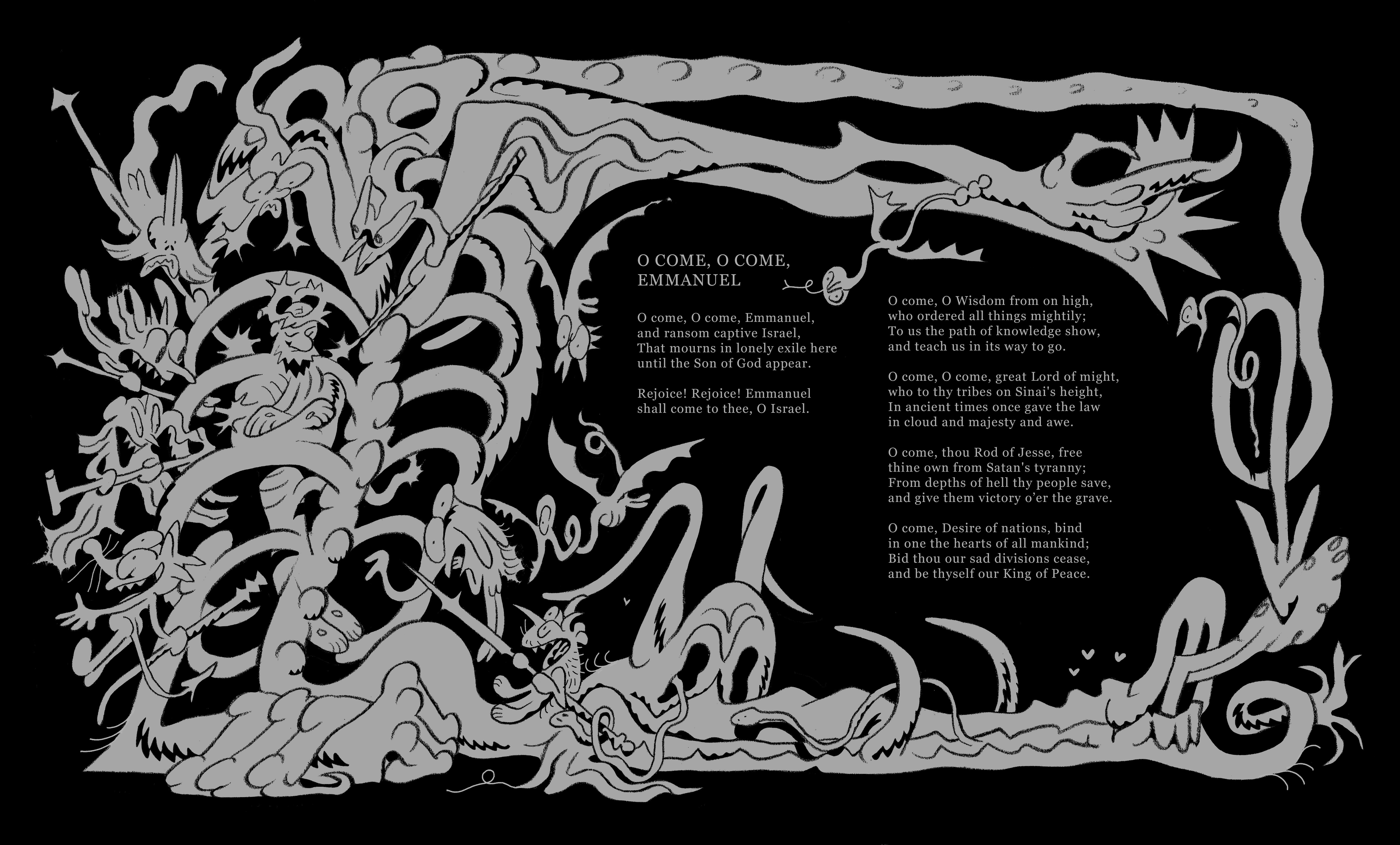
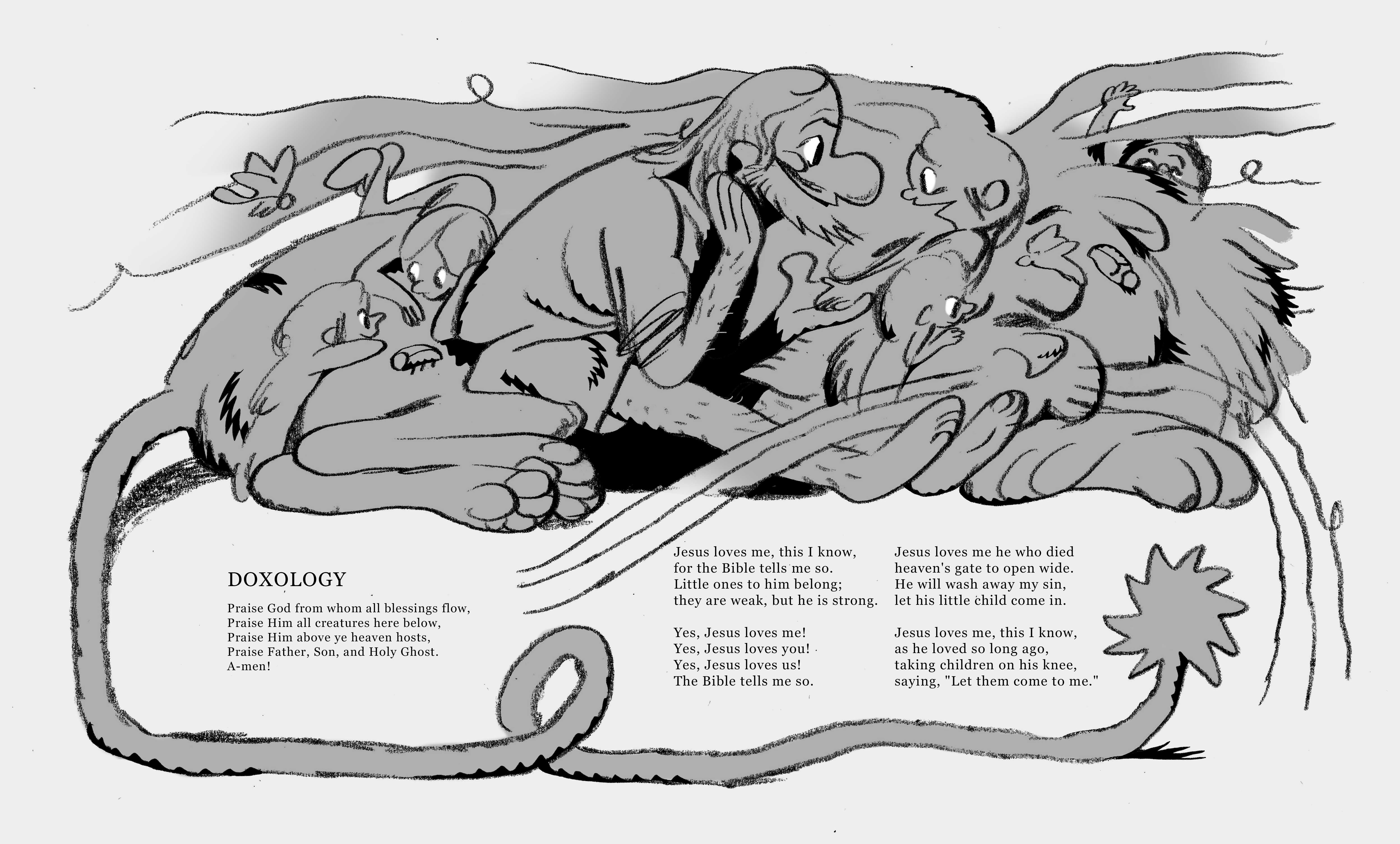
If you’re not inside the Protestant American church you may be unaware of the hand-wringing some of these images could produce. These are for children, but no Christian publisher would be able to print them because they’re dark, scary, weird even! My boys love ‘em and when we sing When I Survey The Wondrous Cross they unconsciously make the sign of the cross by point to Christ’s head, hands, and feet when that line is sung. I’m not Catholic and so this isn’t a tradition I pass on, but rather discovered by the physical participation with text and image. Extraordinary, if I do say so myself.
Thanks for reading. See you next week!
On the readability/flippability/hyper visual comics front I can’t recommend the one shot manga Look Back enough. So simple but so profound. Literature doesn’t have to be hard to read! There are other titles that I’ve come across recently like this, but I can’t quite think of them at the moment.
I’d publish those 😉👏👏