Pictures Worth Considering
The good ones give you more than you might think.

Hello and welcome back! My time at the South Carolina Governor’s School of Arts and Humanities was, in my opinion, time well spent. I taught illustration to eighteen rising ninth graders over two weeks. I began with composition after quickly realizing that most of the students(myself included at their age) very rarely drew composed scenes, preferring instead the singular person, character, or thing to draw or design in isolation. This was really enjoyable because it gave us a chance to actually look and consider a range of illustrations together. Here are some fun ones we talked about.
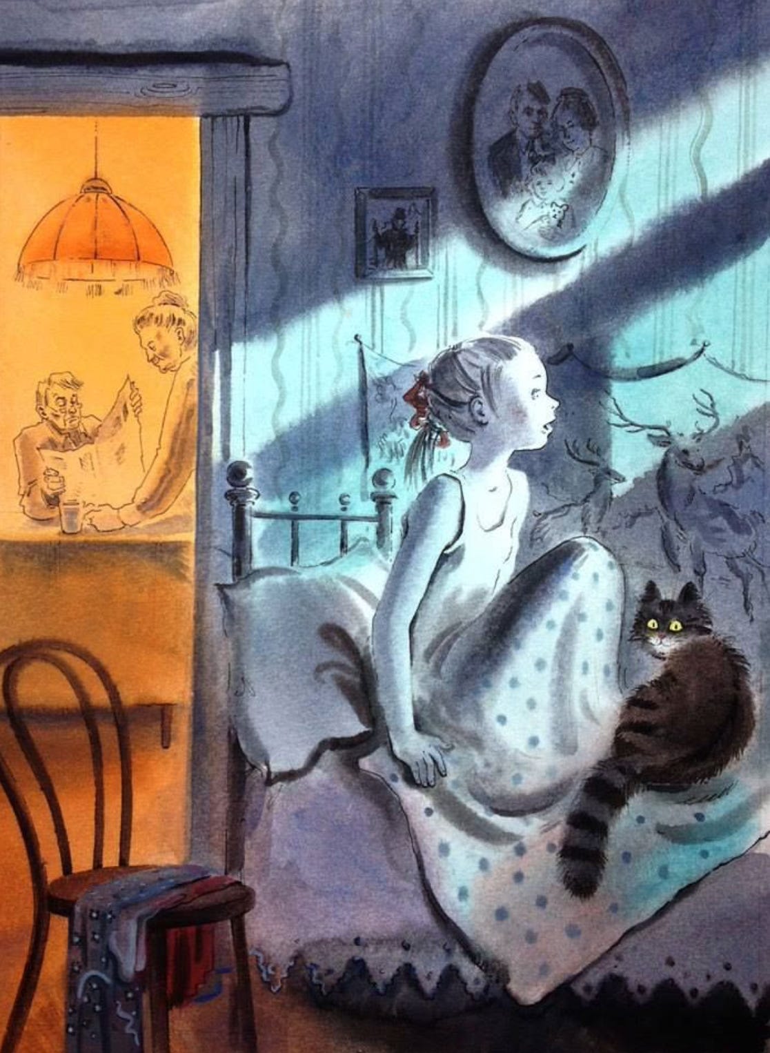
The juxtaposition of two very different “worlds” in this image is striking. The staid, routine, inward lifestyle of an older couple at the warm table is so drastically different than the cool, moonlit, and wild room of the young girl. Everything in the image is there because of the artists choice and speaks clearly. For example, the blue room is wild because, yes, the moonlight and the cat looking at us, but also the deer wall hanging behind her, the squiggly lines of the wallpaper, the polka dot pattern of her blanket and the extreme triangular fringe of her bed. (Thanks for find all the artists for these images Anderson Carman!
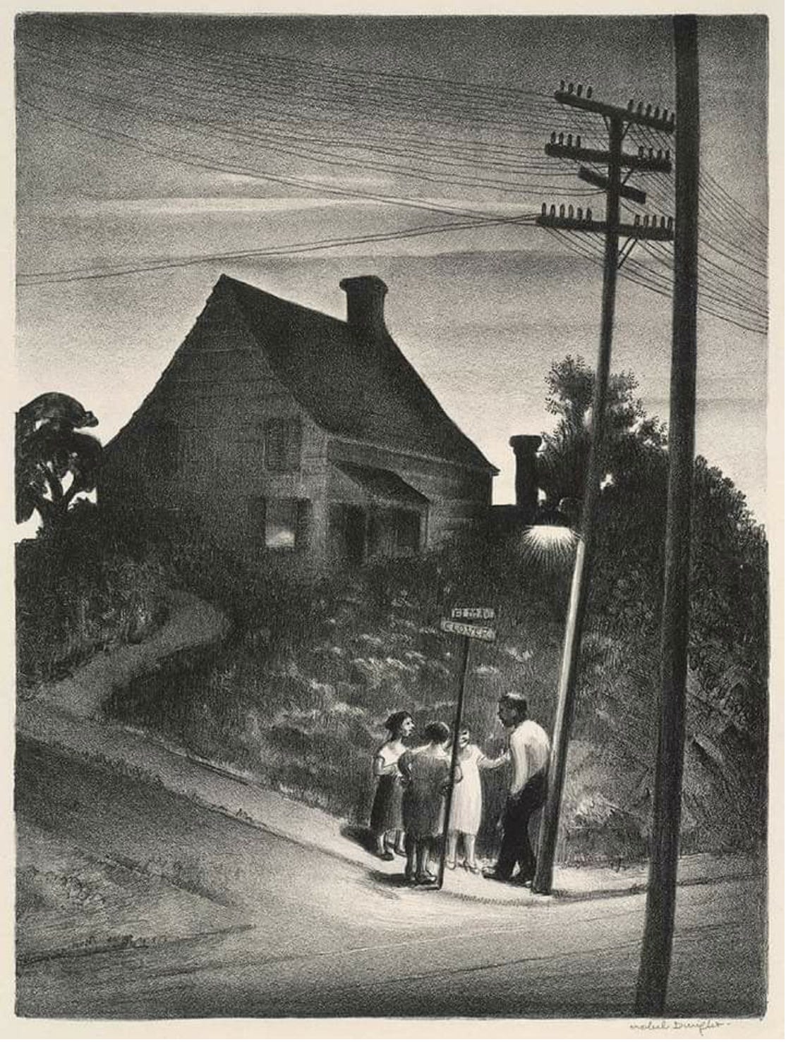
This one showcases how the size relationship of the people and location can be adjusted in a composition to say something about the world in which the characters live. It looms around them and isn’t altogether friendly as the lighting spotlights them against the darkness and vagueness of dusk.
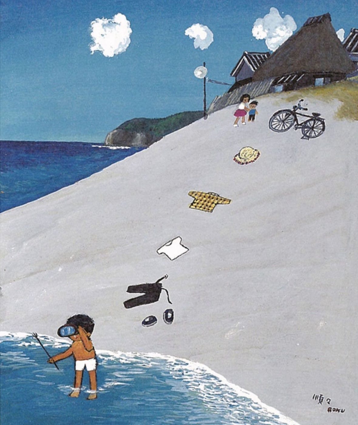
This one is comic, or sequential perfection, the arrangement of elements clearly telling you what happened not very long ago. Also, I know this is a Japanese artist and so the progression from the top right down to the bottom left is intentional because they read their books from right to left. A westerner would flip it, starting at the top left and moving toward the bottom right. It doesn’t really matter that there aren’t words, we read pictures the same and the flow is important. I’ve heard that even movies work this way, if you want to show progression, which is the usual thing you show in a movie, you have everything moving toward the right of the screen, a sense of regression can be achieved by going left as well.
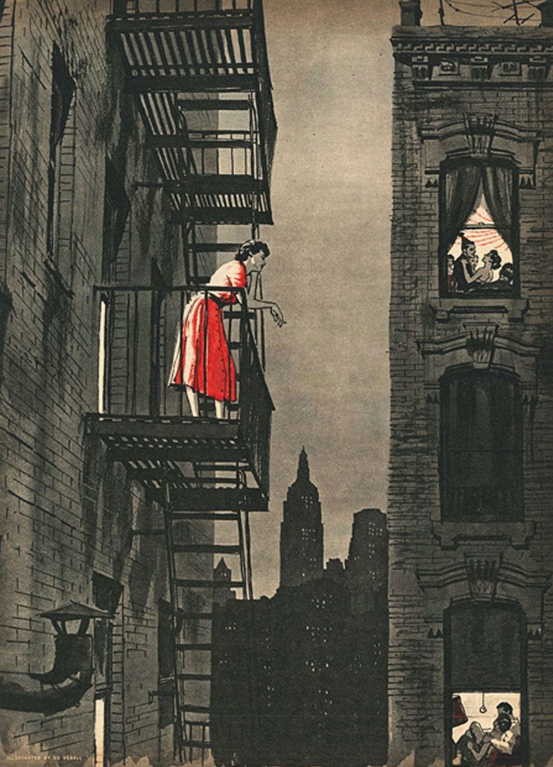
This one is a knockout for several reasons, but the one I accentuated to my class was how the artists guides our eyes into a strong and resonant feeling. We look first at the woman in red, because well, red! But as we consider her we notice her gaze, not up at the stars or the skyline but, we can only assume, at the two sub-images inside the picture, the two windows showing two clear pictures of intimacy and love. The birthday party at the top is lively and fun and the couple on the couch at the extreme bottom of the image is warm and secure. My heart kinda breaks for our woman in red who either has no one, or no one she really wants to be with right now.
I’m going to keep this one short and sweet because I think the value of actually looking and considering the details of the images we consume is seldom encouraged. I think our eyes work faster than our brains and we immediately like and collect images into folders without actually knowing why we like them. Sure, they’re pretty, or cool, or impressive, but the reflection and consideration of their structure, content, and arrangement is not just worthwhile in a pragmatic way, but for sheer pleasure. It is pleasurable to gaze at a good image for a long time. And I’d actually argue this is the test of whether an image is actually good or not, if it can continue to give you pleasure upon extended, and repeated viewing.
I’ll share more about my class and our collective project next week. I hope this puts some pep in your step for the coming work week, find some great images and start enjoying them more. Also, I’m slowing working through continued responses and critiques for those of you who responded to this post seven weeks ago. I am molasses, but at least I’m oozing in the right direction.
Did a little digging and found the artists and titles for most of the pieces here:
Night taxi by Elizaveta Vedina.
Dusk, Staten Island by Mabel Dwight
Unknown by Rokurō Taniuchi.
Loneliness is Dangerous by artist Edward Vebell
I’m enormously curious about your experience as an illustration teacher, specially now! I bet a lot of kids are super nervous about the future of art with AI and all that. Personally I think most complaints are out of panic, I don’t see real art going away at all, although a few things definitely are being threatened by it.
But also all the approaches and ideas for teaching illustration, specially about theory and the hard side of the craft, I’ve usually relied on my own instincts for everything, but I see now that all big things need a structure.